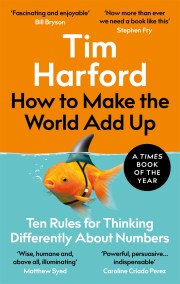
Read an extract from How to Make the World Add Up by Tim Harford

The newspapers had an alarming message for Londoners in April 2018:
‘London’s Murder Rate Is Higher than New York’s for the First Time Ever!’ The headlines played into a narrative of gangs gone wild. And if we ignore for a moment that the very definition of ‘murder’ differs on either side of the Atlantic, this claim is also perfectly true. In February 2018, there were fourteen murders in New York City, but fifteen in London.[1]
But what should we conclude? Nothing.
We should conclude nothing because that pair of numbers alone tells us very little. If we want to understand what’s happening, we need to step back and take in a broader perspective.
Here are a few facts worth knowing about murders in London and New York. London had 184 murders in 1990, while New York suffered 2262 – more than ten times as many. It’s with that image in mind of New York as a murderous place that Londoners are alarmed at the idea that they might have become as rotten as the Big Apple. But London’s murder rate has fallen, not risen, since 1990. In 2017, there were 130 murders in London, including ten people killed in terrorist attacks. London was safe in 1990 and it’s a little bit safer today. As for New York, murders fell to 292 in 2017. That means New York is still more dangerous than London, but much, much safer than in 1990.
(We should really look at the murder rate per million people rather than the murder total, but the populations of New York City and London are similar, so let’s not worry about that.) Now that New York is vastly safer, very occasionally it has a good month and London has a bad one, and New York’s monthly murder count dips below London’s. The thing about numbers is that over time, they do tend to go up and down a bit.[*]
So while the newspaper headlines are narrowly correct, they point us away from the truth rather than towards it: the news is good, not bad; London has become safer, not more dangerous; and London remains safer than the fast- improving New York. We get the real story only with context.
In 1965, two Norwegian social scientists, Johan Galtung and Mari Ruge, made a fascinating observation: what counts as ‘news’ depends very much on the frequency with which we pay attention.[2] If media outlets know most of their audience is checking in every day, or every few hours, they will naturally tell us the most attention- grabbing event that’s happened in that time.
Consider the financial news. There is a big difference between the rolling business coverage of Bloomberg TV, the daily rhythm of the newspaper the Financial Times (my employer), and the weekly take of The Economist, even if the three outlets have a similar interest in business, economics and geopolitics. Bloomberg might pick up on sharp market moves over the past hour. The same moves won’t merit a mention in The Economist. Weekly, daily, hourly – the metronome of the news clock changes the very nature of what is news.
Now imagine a much slower rhythm of news: a twenty-five-year newspaper, say. What would the latest edition say? It would be packed with updates, some hopeful and some grim; it would describe the rise of China, the World Wide Web and smartphones, the emergence of al- Qaeda and the collapse of Lehman Brothers. There might be a small feature article on crime, noting that the murder count had fallen in London, but not nearly as much as in New York. Nobody would spare a syllable on the idea that London was experiencing a killing spree; such an observation could only make sense in a fast-twitch media outlet.
How about a fifty-year newspaper? Max Roser, a young economist who created the Our World in Data website, proposed that idea, inspired by Galtung and Ruge. Roser imagines a newspaper published in 1918, 1968 and 2018.
Topics that seemed earth- shattering to the daily newspapers of the time might not be mentioned at all, while huge changes in the world would scream from the front pages.[3]
What would the front page of the fifty- year newspaper say in 2018? One possibility might be a story about something that didn’t happen: ‘Phew! World Avoids Nuclear Armageddon!’ Readers of the 1968 newspaper would have read anxiously about how, over the previous three decades, the atomic bomb had been invented, developed, used on Japan with catastrophic effect, then superseded by vast arsenals of much more powerful hydrogen bombs, and how the superpowers had flirted with nuclear conflict repeatedly – in the Korean War, during the Cuban missile crisis, and more than once over Berlin. For a reader picking up a newspaper in 2018 for the first time since 1968, it would be big news that the Cold War had simply ended without a nuclear exchange of any kind – even if no daily newspaper would have been tempted in the meantime to run with a headline reading ‘No H-bombs Dropped Today’.
Or perhaps the editors would splash with a story on climate change. Since early research on the greenhouse effect probably wouldn’t have merited a mention in the 1968 edition, the 2018 newspaper would have to start with an explanation of the basic problem: burning fossil fuels such as gas, oil and coal turns out to alter the composition of the atmosphere in a way that helps it trap heat. (Headline: ‘Gah! Burning Coal Turns Out to be a Terrible Idea!’) That explanation would be illustrated by an alarming graph showing the increase in global temperatures.
Climate change is a difficult thing to report over a short time horizon. On an annual basis global temperatures bounce up and down; you can find almost as many years when they have fallen as when they have risen – which is raw material for the manufacturing of doubt. The fifty- year newspaper, however, conveys the grim news clearly: temperatures have risen by about 0.75ºC since the 1960s, depending on exactly what temperature measure you look at and between which years.[4] Alas, from the right perspective, the trend is clearly that the planet is heating up.
How about a hundred-year newspaper? The perspective changes again. Thinking about readers who last consulted a newspaper in 1918, you might decide to offer a leading story about the miracle of safe childhood: ‘Child Mortality Falls by a Factor of Eight!’ Imagine a school set up to receive a hundred five-year-olds, randomly chosen at birth from around the world. In 1918, only sixty-eight children would have turned up for the first day of school; thirty- two would have died before reaching the age of five. This wasn’t some temporary catastrophe because of the terrible 1914‒18 war, or the global influenza outbreak of 1918: in 1900 the statistic would have been even worse. Now, ninety- six children show up safely for their first year in school; just four die before reaching school age. Remember, they’re selected from all over the world, including the poorest, most isolated and most strife-torn of countries. That is astonishing progress.[5]
For a two- hundred- year newspaper, the editorial board might take yet another angle: ‘Most People Aren’t Poor!’ There are still a lot of poor people, of course – between 600 and 700 million now live in what we call extreme poverty, according to the World Bank’s definition as an income of less than around $1.90 per day. That’s not far from one in ten of the world’s population. But in the early nineteenth century, almost everyone – nineteen people out of twenty – lived in that state of destitution. That’s wonderful progress, and it becomes apparent only if we step back and change our perspective.
[*] In 2019, for example, London saw 149 murders – the highest number for a decade. There has been a rise since 2016. UK media tend to present this rise as apocalyptic; with context, it looks less worrying but is clearly a move in the wrong direction. A temporary blip, or a reversal of the long decline in murder rates? ‘Only time will tell’ is a cliché; it’s true, though.
[1] For more reporting on this issue, listen to the 8 June 2018 episode of More or Less, presented by me and researched by my colleagues Richard Fenton-Smith and Richard Vadon: https://www.bbc.co.uk/programmes/p069jd0p
[2] Johan Galtung and Mari Holmboe Ruge, ‘The structure of foreign news: The presentation of the Congo, Cuba and Cyprus crises in four Norwegian newspapers’, Journal of Peace Research, 2(1), 1965, 64–90.
[3] Max Roser, ‘Stop Saying that 2016 Was the Worst Year’, Washington Post, 29 December 2016, https://www.washingtonpost.com/posteverything/wp/2016/12/29/stop- saying- that- 2016- was- the- worst- year/?utm_term=.bad894bad69a; see also NPR’s Planet Money, ‘The Fifty Year Newspaper’, 29 December 2017, https://www.npr.org/templates/transcript/transcript. php?storyId=574662798
[4] C. P. Morice, J. J. Kennedy, N. A. Rayner and P. D. Jones, ‘Quantifying uncertainties in global and regional temperature change using an ensemble of observational estimates: The HadCRUT4 dataset’, Journal of Geophysical Research, 117(D8), 2012, https://doi.org/10.1029/2011JD017187, describing data from the Met Office Hadley Centre. The data are charted by and downloadable from ‘Our World in Data’, https://ourworldindata.org/co2-and-other-greenhouse-gas-emissions. In the 1960s, global temperatures were typically around 0.1ºC below the average of 1961–90. In the twenty-first century they’ve typically been about 0.6ºC above that average, and more recently above 0.7ºC. Increase in temperatures, then, over the past fifty years, has been 0.7–0.8ºC.
[5] Max Roser, ‘The short history of global living conditions and why it matters that we know it’, 2018, published online at OurWorldInData.org, retrieved from https://ourworldindata.org/a-history-of-globalliving-conditions-in-5-charts; for Child Mortality, Roser cites data from Gapminder and the World Bank.


